Contact Form 7 で星形の5段階評価を作成
カテゴリー: WordPress
この記事は2019年6月22日に書かれたものです。情報が古い可能性がありますのでご注意ください。
WordPress のメールフォームプラグインといえば、Contact Form 7 と MW WP Form が有名ですが、それぞれに特徴があり、案件によって使い分けています。
簡単にフォームを作成できて、追加のプラグイン等による機能拡張が多いのが Contact Form 7、細かい設定ができて、出力される HTML をコントロールしやすいのが MW WP Form かなと感じています。
このたび、既に Contact Form 7 を使っているサイトで、新たなフォームの作成案件があり、その中に星形の5段階評価を付ける項目がありました。星形のインターフェイスは必須ではなかったのですが、要望ですし、フォームに(Contact Form 7 でというわけではなく)星形の5段階評価を作成する方法は、検索するといくつか紹介されていますので、できないことはないだろうと、実装してみました。
考え方として、5段階評価はラジオボタンによる選択とし、CSS で星形のインターフェースを作るのですが、いくつかの記事で紹介されている方法は以下のようなもの。
HTML
<form type="get" action="">
  <div class="stars">
    <input id="star5" type="radio" name="star" value="5" />
    <label for="star5">★</label>
    <input id="star4" type="radio" name="star" value="4" />
    <label for="star4">★</label>
    <input id="star3" type="radio" name="star" value="3" />
    <label for="star3">★</label>
    <input id="star2" type="radio" name="star" value="2" />
    <label for="star2">★</label>
    <input id="star1" type="radio" name="star" value="1" />
    <label for="star1">★</label>
  </div>
</form>
CSS
.stars{
  display: flex;
  flex-direction: row-reverse;
  justify-content: right;
}
.stars input[type='radio']{
  display: none;
}
.stars label{
  padding-right: 10px;
  color: #ccc;
  font-size: 30px;
  cursor: pointer;
}
.stars label:hover,
.stars label:hover ~ label,
.stars input[type='radio']:checked ~ label{
  color: #fc0;
}
ラジオボタンの input 要素が同一階層(同じ親要素)の中にあり、CSS の間接セレクタ( ~ )で選択した星の後続の星の色も変えています。
しかし、Contact Form 7 のラジオボタンで生成される HTML は、各々の input 要素がそのラベルとともに <sapn class="wpcf7-list-item">〜</span> で囲まれます。また、Contact Form 7 ではラジオボタンとラベルを関連付けるのに、label 要素を明示的に使用することができないので、更に <label>〜</label> で囲むことになります。
でもこれは、JavaScript を使って選択されたラジオボタンの親要素に何らかの class 値を付与することで解決できそうです。
また、後続(つまり、より低い評価)の星の色を変えるため、5つのラジオボタンのラベルを全て“★”として星5から星1の順に記述し、CSS3 の Flexbox を使って右から並べてありますが、5つのラジオボタンのラベルが全て同じなのではスクリーンリーダーで判別できないので、判別できるラベルにしたいと思いました。
ただ、ラベルにスクリーンリーダーで読まれる非表示テキストを追加しようにも、Contact Form 7 ではラベルに HTML タグを入れるとそのまま出力されてしまいます。そこで、素直に(?)ラベルを“★”から“★★★★★”とし、重ねて表示することにしました。(スクリーンリーダーで記号を読まない設定にされてると意味ないのですが)
Contact Form 7 の記述
[radio star id:star use_label_element "★★★★★" "★★★★" "★★★" "★★" "★"]出力された HTML
<span class="wpcf7-form-control-wrap star">
  <span class="wpcf7-form-control wpcf7-radio id="star">
    <span class="wpcf7-list-item first">
      <label>
        <input type="radio" name="star" value="★★★★★" />
        <span class="wpcf7-list-item-label">★★★★★</span>
      </label>
    </span>
    <span class="wpcf7-list-item">
      <label>
        <input type="radio" name="star" value="★★★★" />
        <span class="wpcf7-list-item-label">★★★★</span>
      </label>
    </span>
    <span class="wpcf7-list-item">
      <label>
        <input type="radio" name="star" value="★★★" />
        <span class="wpcf7-list-item-label">★★★</span>
      </label>
    </span>
    <span class="wpcf7-list-item">
      <label>
        <input type="radio" name="star" value="★★" />
        <span class="wpcf7-list-item-label">★★</span>
      </label>
    </span>
    <span class="wpcf7-list-item last">
      <label>
        <input type="radio" name="star" value="★" />
        <span class="wpcf7-list-item-label">★</span>
      </label>
    </span>
  </span>
</span>
ちなみに、上記はラベルと送信される値を同じにしていますが、Contact Form 7 の記述を "★★★★★|5" "★★★★|4" "★★★|3" "★★|2" "★|1" などとすれば、出力される HTML の value 値はラベルと同じですが、Contact Form 7 のパイプ機能によって、| の右側の値(5 〜 1)が送信されます。
JavaScript
<script>
jQuery(function($) {
  $('#star input:radio').change(function(){
    $('#star .wpcf7-list-item').removeClass('checked');
    if ( $(this).prop('checked') ){
      $(this).closest('.wpcf7-list-item').addClass('checked');
    }
  });
});
</script>
選択されたラジオボタンの親要素となる .wpcf7-list-item に class 属性値 ‘checked’ を付与します。
CSS
#star {
position: relative;
}
#star .wpcf7-list-item {
position: absolute;
top: 0;
left: 0;
}
#star input[type='radio'] {
position: absolute;
opacity: 0;
}
#star .wpcf7-list-item-label {
color: #ccc;
font-size: 180%;
letter-spacing: .5em;
cursor: pointer;
}
#star .wpcf7-list-item:hover .wpcf7-list-item-label,
#star .wpcf7-list-item:hover ~ .wpcf7-list-item .wpcf7-list-item-label,
#star .wpcf7-list-item.checked .wpcf7-list-item-label,
#star .wpcf7-list-item.checked ~ .wpcf7-list-item .wpcf7-list-item-label {
color: #fc0;
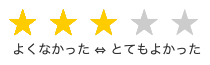
}“★★★★★”から“★”のラベルを左を基準に重ねて表示し(“★”が最前面)、間接セレクタと子孫セレクタを使って後続の星の色を変えています。
また、先の例ではラジオボタンを display: none; で消してありますが、キーボードでフォーカスすることができなくなりますので、opacity: 0; で消しています。
キーボードで操作する場合、左右の矢印キーの操作と星の選択が逆になるのが課題ですが、とりあえず星形の5段階評価を実装することができました。